
Agent Dashboard
The agent dashboard gives you a quick overview of the status of all your OMCs at a glance. Charts summarise requests and actions across your entire portfolio — and every chart is clickable. If a chart shows you have 5 overdue requests, click it to drill straight into those 5 records.
Users can add, remove and rearrange charts so the dashboard shows the data that matters most to them.
Default Charts
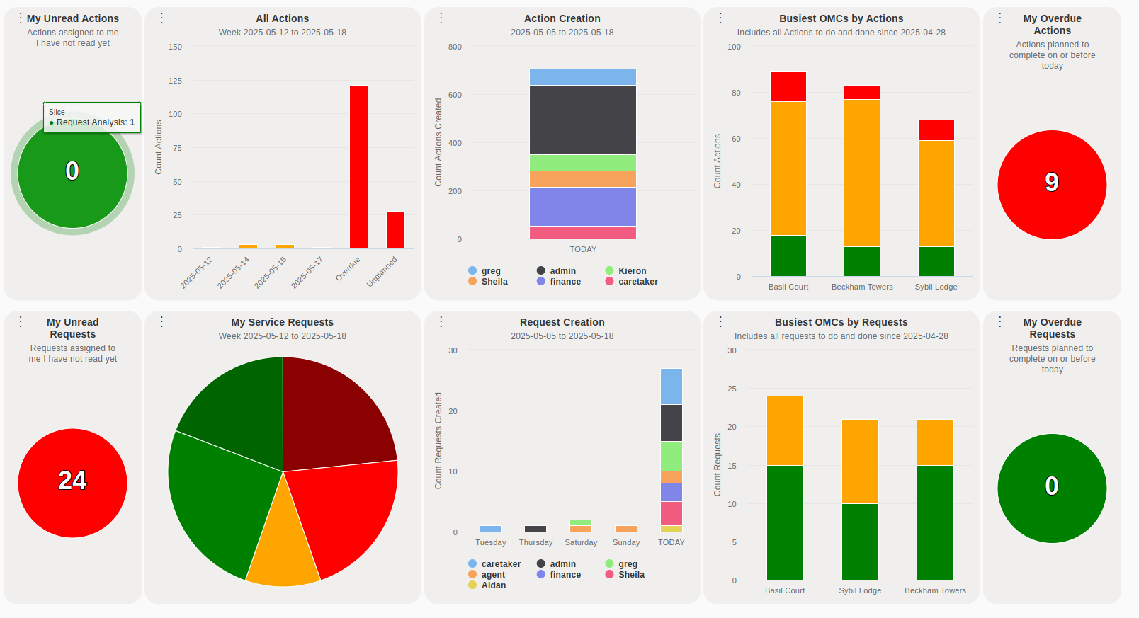
Section titled “Default Charts”The dashboard opens with two rows of charts: one for actions and one for requests.
Actions
Section titled “Actions”- My Unread Actions — A colour-coded circle (green = on top of things, red = needs attention) showing actions assigned to you that you have not yet opened.
- All Actions — A summary of all actions across the agency. Property managers may want to change this to My OMC Actions to filter to their OMCs only.
- Action Creation — Shows which user is creating actions. Property managers can switch to My OMC Action Creation to filter to their OMCs.
- Busiest OMCs By Actions — Highlights which OMCs have the most action activity. Property managers can choose a version filtered to the OMCs they manage.
- My Overdue Actions — A colour-coded circle showing actions assigned to you where the planned date has passed.
Requests
Section titled “Requests”- My Unread Requests — A colour-coded circle showing requests assigned to you that you have not opened since being made owner.
- All Service Requests — A summary of all service requests across the agency. Property managers may want to change this to My Service Requests.
- Request Creation — Shows which user is creating requests. Property managers can switch to My OMC Service Requests.
- Busiest OMCs By Requests — Highlights which OMCs are generating the most requests. Property managers can choose a version filtered to the OMCs they manage.
- My Overdue Requests — A colour-coded circle showing requests assigned to you where the planned date has passed.
Customising Charts
Section titled “Customising Charts”Click the  icon beside any chart name to open its options:
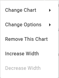
- Change Chart — Replace this position with a completely different chart.
- Change Options — Adjust chart settings, for example to see last week’s data instead of today’s.
- Remove Chart — Remove the chart from your dashboard. You can always add it back later.
- Increase Width / Decrease Width — Expand or narrow the chart within its row.
Click the  icon at the left of any row to:
- Add Chart — Add another chart to that row.
- Auto Refresh — Toggle automatic refresh. When enabled, the dashboard updates every 5 minutes — useful for a large office display screen.
Suggested Configuration
Section titled “Suggested Configuration”The right set of charts depends on your role. Here is a sensible starting point:
Actions
Section titled “Actions”| Chart | Suggestion |
|---|---|
| My Unread Actions | Keep |
| All Actions | Change to My Actions (unless you are the agency owner or manager) |
| Action Creation | Property managers: change to My OMC Actions to monitor your OMCs. Others: remove |
| Busiest OMCs By Actions | Property managers: change to My Top OMCs By Action. Others: remove |
| My Overdue Actions | Keep |
Requests
Section titled “Requests”| Chart | Suggestion |
|---|---|
| My Unread Requests | Keep |
| All Service Requests | Change to My Service Requests |
| Request Creation | Property managers: change to My OMC Service Requests to catch requests on your OMCs regardless of who owns them. Others: remove |
| Busiest OMCs By Requests | Property managers: change to My Busiest OMCs By Request. Others: remove |
| My Overdue Requests | Keep |